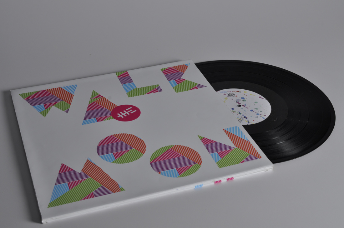
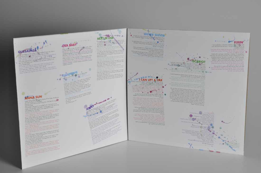
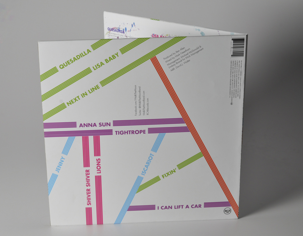
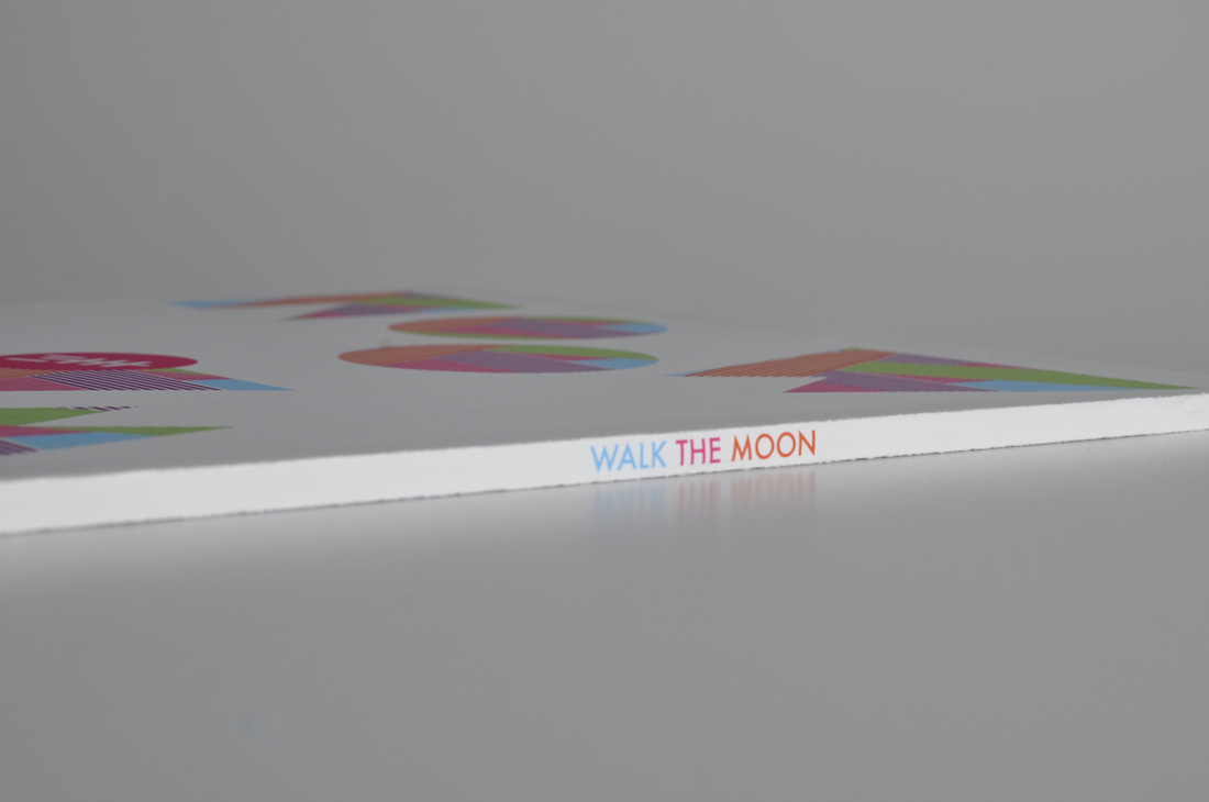
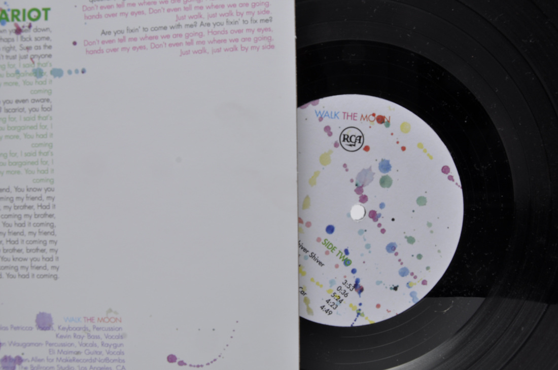
I write this while sitting in the sun on my back patio. Yes, the semester has ended (with the exception of one final I have to go back for on Monday), and summer has begun. In my last blog post I wrote about my recently published photography book and mentioned my final design project. I have officially finished, and photographed, my album redesign. I redesigned the cover of Walk The Moon's self titled album. The rules for this assignment were that we could only use typography, since it is a typography class. I based my design off of the fun quality of their music as well as the 80's vibe that I get from some of their songs. The inside was also inspired by their music video for their song "Anna Sun". Below are some of the many photographs I took of my final LP. You can also check out this project, along with some others, on my behance: https://www.behance.net/kelliseiple
0 Comments
The semester is winding down and classes are coming to an end. We're finishing up our LP's in design class and in photography we have finished our final books. Having the experience of taking photographs for a book, and publishing the final product was extremely rewarding. My book is a black and white joinery through desolate and abandoned areas in and around the Philadelphia area. You can preview the first 15 pages of my book entitled "No Trespassing" OR buy my book at the link below! http://blur.by/1DeTkPM We also worked in the studio and were able to learn how to use the studio equipment and take some practice shots using objects we had with us. A few shots I took can be found below… Along with learning how to work in a studio setting we were able to make large prints of a few selected shots. I picked a few that I did not get to add to my final book. The ones I chose can be seen below. From learning film photography and the darkroom to digital photography, publishing a book, making prints, and learning studio photography, this class has truly been one of my favorites. Check back for my next blog post which will feature my completed LP. And again, don't forget to check out my first published book, http://blur.by/1DeTkPM !!
It's hard to believe that midterms are in a few weeks, and before I know it I'll be half way through my college experience. This semester has been wonderful, my design class is going great and I am falling in love with film photography. I will have to restrain myself from posting every picture I took through my first two rolls of film but it's difficult when the area you live in is drop dead gorgeous (even in the harsh winter months). Before I jump into my photography I'm going to show you what I've been working on in my design class. Right now we are doing typographic exercises, these are small projects that last about 2 weeks, I featured our first one in last blog post. Since then I have completed three more. First, was an exercise called Reductive letters, which was completed in a set of two. The first panel was a singular letter in a chosen typeface and the second was two letters juxtaposed, one a sans-serif typeface, the other a serif. Here are the results. The next exercise was in color ( yes, the long awaited use of color). This project focused on typographic patterns. We were to repeat and rotate one or more letterforms to create a pattern and then add color to create different effects, the final was a set of three panels. (The letter I used was 'D'). Most recently, was an exercise called "Word and Meaning". We had to choose a word, from a list of 10, and arrange our chosen word to express its meaning. I chose the word "destruction" and my final was done by printing out the letters, then cutting them up, taping them down, splattering them with black paint, then scanning it back into the computer and editing. I love that this project was done by hand which gives it a balanced look between handcrafted and digital. Design will always be my first love, but photography is quickly becoming my second. Below I'm going to show you some of my pinhole photography, and film photography. Our first project was a quick experiment with pinhole photography. These images below were taken with a quaker oats can, and yes I am still amazed by that. On the left, the original prints, on the right, the inverted and flipped prints. (Top- 90 sec exposure, Bottom- 1 min 45 sec exposure) Now, film photography. I was extremely nervous to get started with this, after all it's been a while since I haven't been able to see my pictures directly after taking them (aka elementary school). Once I started I became extremely excited, and now one may say, obsessed, with finding a film camera of my own. We are currently using the schools film cameras, which are Minoltas, and as I said, I am dying to find one of my own. So first, we loaded the film onto a film reel and into a tank, in complete darkness, which is equally terrifying and exciting all at once. Then you must go through the development process, once the film is dry you make a contact sheet then start with enlargements. It's a long process but I must say I enjoy it. So of course I have made many enlargements at this point, a lot of them slightly off in some way, but so far I have 4 completed enlargements, 3 of which I am going to use for my graded assignment. I have not scanned my prints into the computer yet so I will be showing you some of my negative scans (these are unedited but I couldn't wait to put them up here). The above three are the ones that I plan on using for my graded assignment, the last one is probably my favorite. All 3 of these were taken at the Wissahickon trail in East Falls. These are three images I took on my campus, also located in East Falls, Philadelphia. The above six were also all taken at the Wissahickon trail, which looked like a winter wonderland. The first picture is of my boyfriend, taken outside of our church, Citylight. The middle picture is of my first two prints. The top ones, are test exposures, the bottom ones are final prints. The last picture is of the two rolls of negatives and my contact sheets. I hope you enjoyed this look at my life through the past month.
This semester I am taking a typography class and a photography class so hopefully I will have a lot of work to show you in the next few months. My first project for my typography class was to create a modular type, starting out on graph paper and then creating the final product in Illustrator. I ended up with two final projects as a result of neither my design professor or myself being able to choose between the two. The two final products are below.
It's been a crazy and busy semester for me at PhilaU, from concerts and fun adventures in Philly, to lots of design work and tons (I'm talking 500 free prints) of readings for my humanities class. So here is a quick update on my design projects and some personal projects! This semester in design we had three projects. Our first project was an icon project, which was my favorite project of the semester. We were to create a set of three icons for a chosen field (I picked hospitality management). On the left you can see the tons of prisma color sketches I went through just to start on the computer. On the right is my final set of icons (beer, wine, and cocktails). Next, we did an instruction manual, I decided to stick with my chosen topic of hospitality management. My tool was a corkscrew wine bottle opener. I chose it because of it's interesting and fun silhouette. I photographed everything and then edited the pictures in photoshop. My favorite part of the project is the cover designs, the wine splatter was an actual wine splatter from when we spilled the wine while photographing. On the left, the wine spilled, on the right the final (back and front) cover design edited in Photoshop and placed in InDesign. Our final project was a poster project. My topic started out as hospitality management but by the end could probably be viewed more as animal conservation. My issue was fish depletion, by over fishing and the serving of unsustainable seafood in restaurants. The end result is meant to mimic an eye chart. A very busy semester had left me with minimal time for personal projects but a few things I have worked on in my free time include, a tutu for the color run in Camden, placemats, napkins and pillows for my new apartment, and a arm knitted scarf I made last night. Not to mention the numerous baked goods I have made this semester for my on campus ministry! On the left are one version of my placemats and napkins (the only picture I have) and on the left are my two pillows and my tapestry (I did not make the tapestry although I did add loops to it to hang it on my apartment wall). The pillows are double sided.
Last but not least, some of my baking creations from this semester!! From left to right. Pumpkin spice cupcakes with cream cheese frosting and caramel. Apple cider mini muffins. Hot cocoa cookies. Turkey Cupcakes (I think these are pretty adorable).
After 3 weeks of being an arts and crafts speciality counselor I have decided to share some of the activities I have been coming up with and a picture of some examples I have made for my lessons. Week One was fun in the Sun and I did crafts such as paper plate pufferfish, treasure map making, and popsicle stick sailboats; I only have a picture of the treasure map from the first week. Week two I was away but left lesson plans with crafts such as patriotic pinwheels, windsocks, and stars; all of which I have pictures of. Week 3 was around the world week so we made good luck hands (Khamsa), which is a Moroccan tradition, family crests to show family heritage and more, and Sugar skull masks for Day of the Dead. I also had the older kids play around with Tangram puzzles (A Chinese puzzle).
Currently working on some longboard designs before I have to start studying for finals. My blank deck on the left, some sketches on the right : )
This is my project that I am about to turn in today, the assignment being "wearable art". I chose the shoulders as my body part. The materials I used were: Bristol paper, Sobo glue, loctite glue, matte black spray paint, and gold/bronze studs. The outfit I'm wearing (Black dress with gold studded belt) was part of my inspiration when coming up with my design concept.
|
Archives
May 2015
Categories |