Vaccines Save Lives
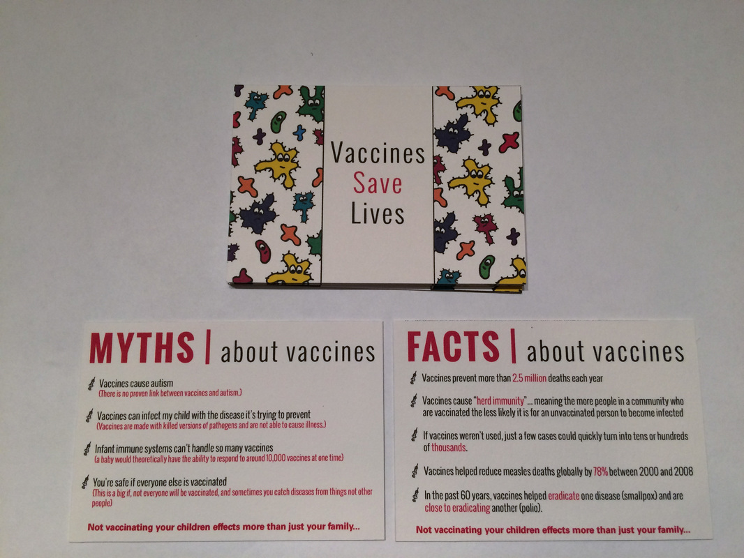
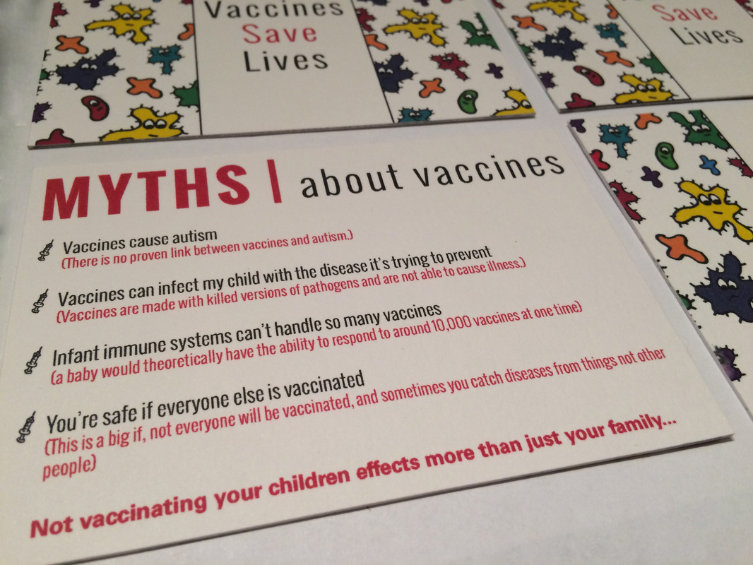
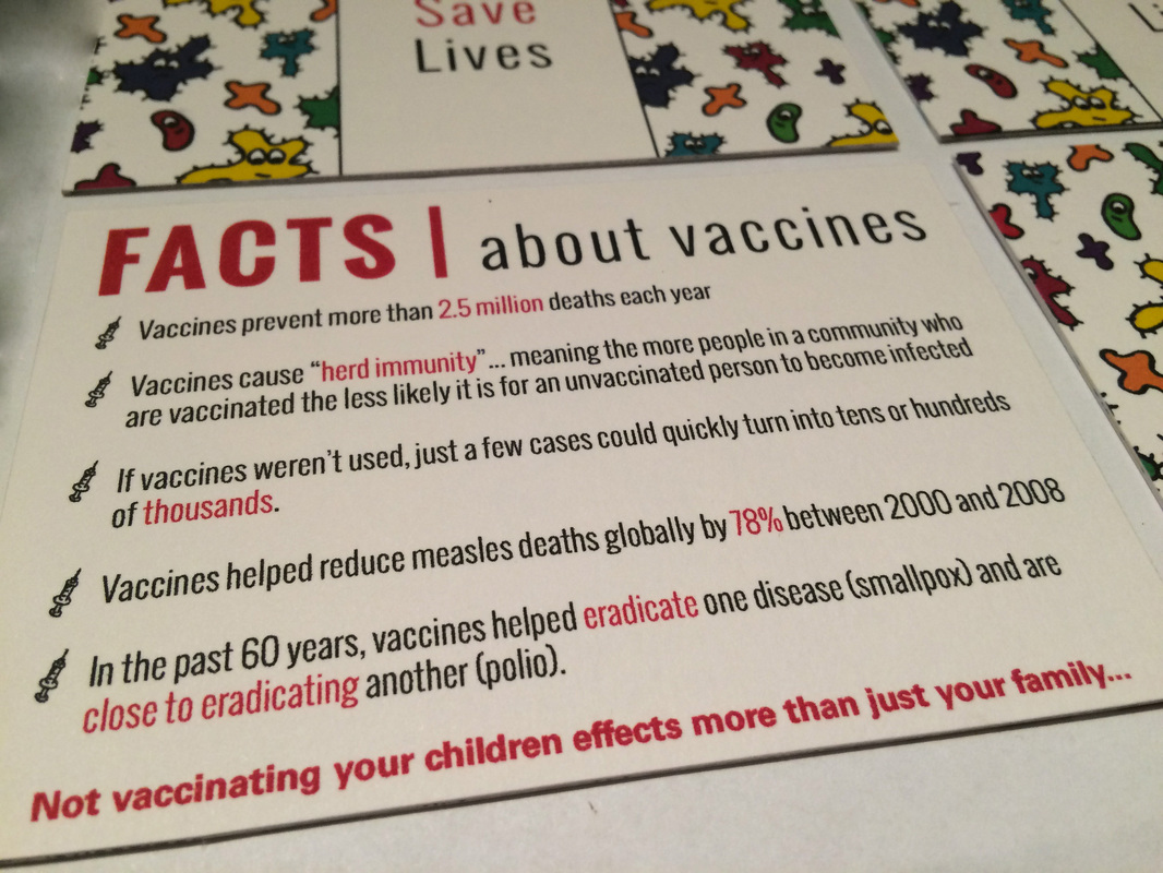
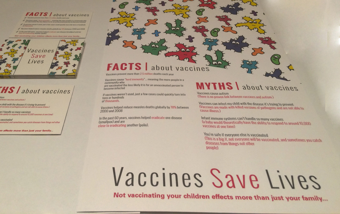
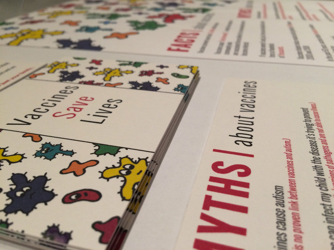
Vaccines Save Lives was a project I did for my biology class. Our mission was to fuse our major together with a topic from class. I chose vaccines since the anti-vaccination movement has been big recently. I wanted to design cards to give to new mothers to encourage them to vaccinate their children. I then extended this out to a poster that could go in children's doctor's offices. The idea behind the design was to be fun and encouraging rather than using scare tactics like many other vaccine related designs I had come across. I used illustrations and bright colors to achieve this. The cards feature two different backs, one with common myths about vaccines and the other with important facts.
|
|
|
|
2015 Collab Competition: Self Identity
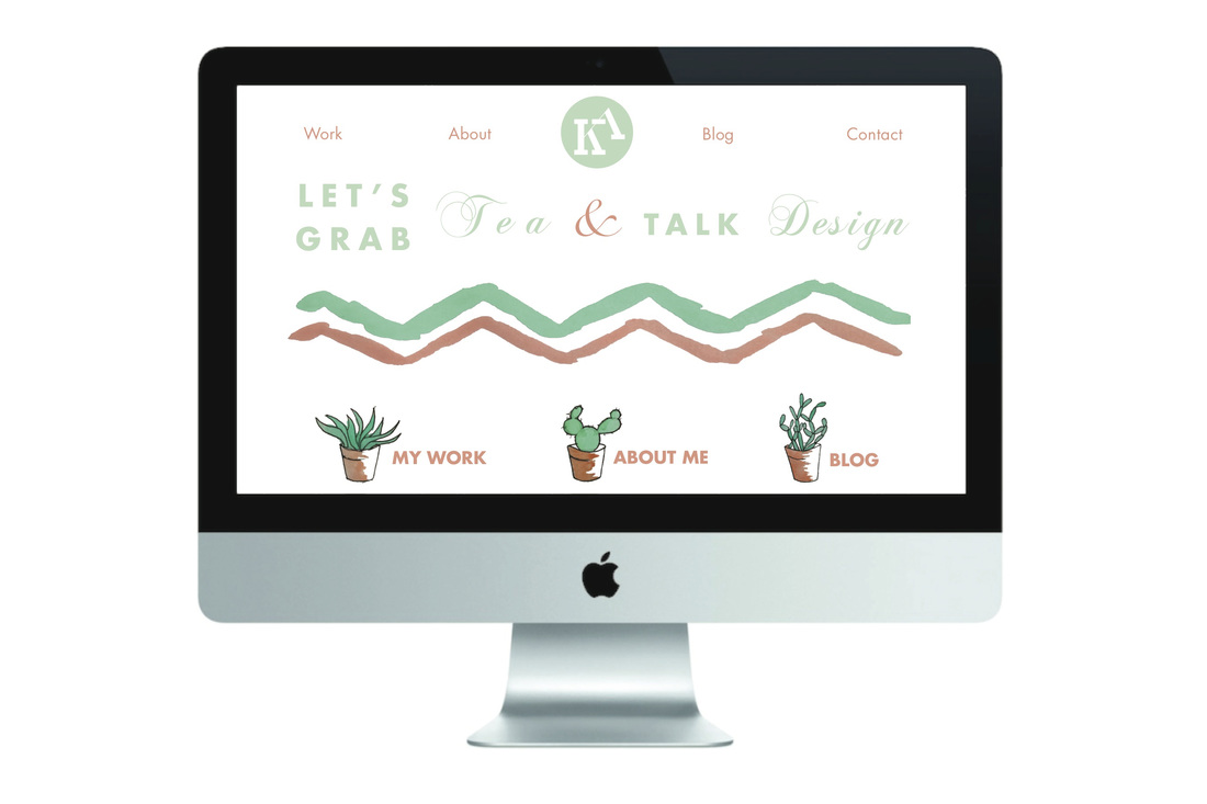
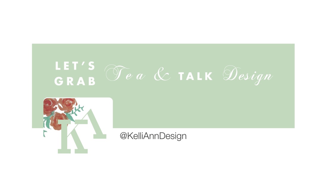
Below is my most recent project which placed top 30 in the Philadelphia Museum of Art 2015 Collab Student Design Competition. On display at the Philadelphia Museum of Art from 11/16/15-11/20/15. The project was called Selfie and the task was to create a self identity including a logo, social media icon, business card, website (desktop and mobile), and a self promotional 3D piece. Enjoy and please go vote for me to win People's Choice Award!! http://woobox.com/ua4gyb/gallery/unXK6AidmIU
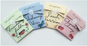
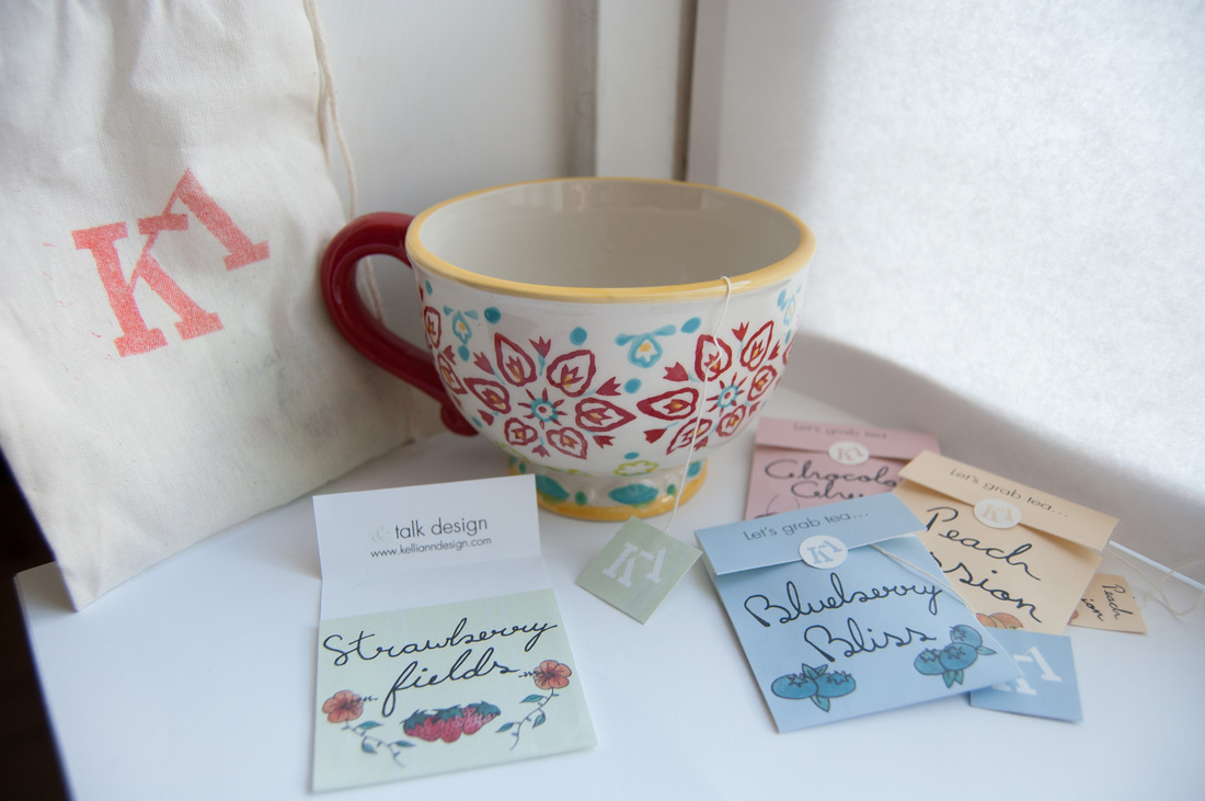
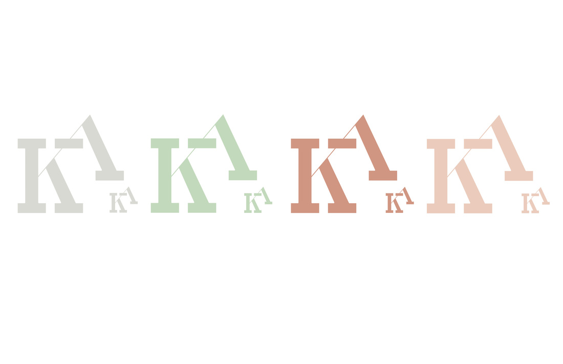
Design Statement: When thinking about how to create my brand I knew I wanted to design an identity that would encompass who I am as a person and as a designer. I based my brand off of my love for coral and mint and my experimentations with watercolor. I wanted my brand to show off my lighthearted and whimsical personality while inviting people into my little world full of graphic design and excessive tea drinking.
Design Statement: When thinking about how to create my brand I knew I wanted to design an identity that would encompass who I am as a person and as a designer. I based my brand off of my love for coral and mint and my experimentations with watercolor. I wanted my brand to show off my lighthearted and whimsical personality while inviting people into my little world full of graphic design and excessive tea drinking.

|

|
LP Redesign: Walk The Moon
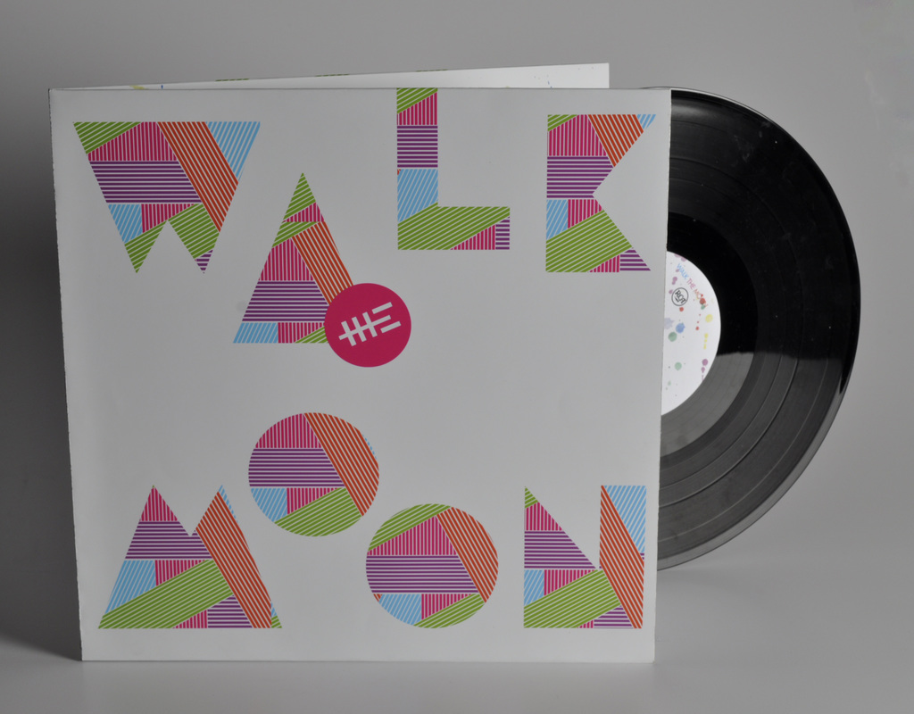
This was my final project for Design 4 (Intro to Typography). We were to recreate an album including front, back, inside, and the sticker for the actual record. I chose Walk The Moon's self titled album and based the look around their fun and retro sound as well as the interaction they have with their fans. The paint splatters represent a tradition between their fans and themselves where they paint their faces based off of their music video for Anna Sun. Below are some of my studio shots.

|

|

|
Type Exercises
One of the other pieces in a set of typography exercises, this project focuses on tone. We were given a segment from a magazine and had to rearrange it to create an interesting layout within the 8X8 square.

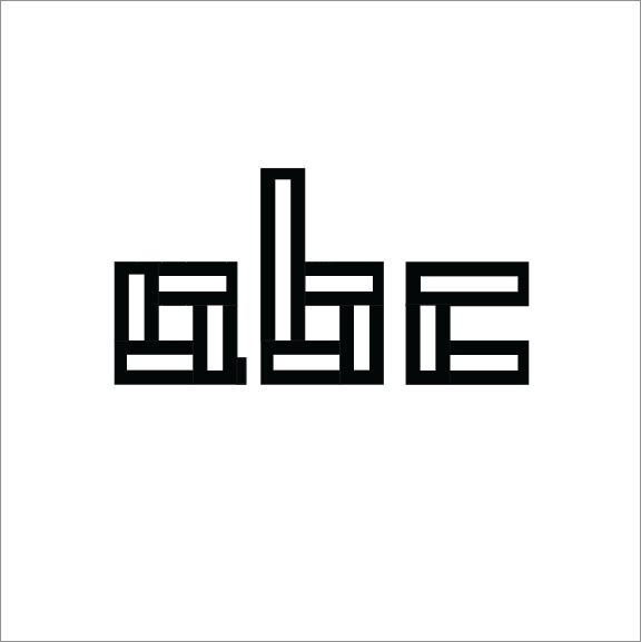
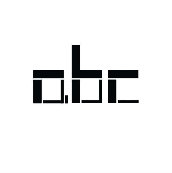
My first project for typography (design 4). We were to create a modular typeface. Unable to decide between the two, here are my two final projects. The first one plays with counter form and movement while the second one plays with line weights.
|
|
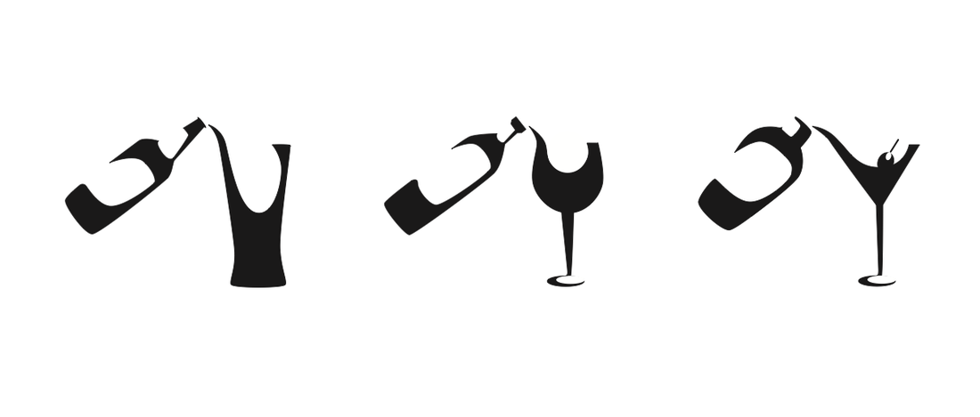
Icon Design
Project 1 (Design 3): Design a set of three icons for a chosen field (hospitality management)
Instruction Manual: Wine Bottle Opener
Project 2 (Design 3): Design an instruction manual for a chosen tool in your chosen field. I stuck with hospitality management and chose to do a corkscrew wine bottle opener. Flip through my instruction manual below!
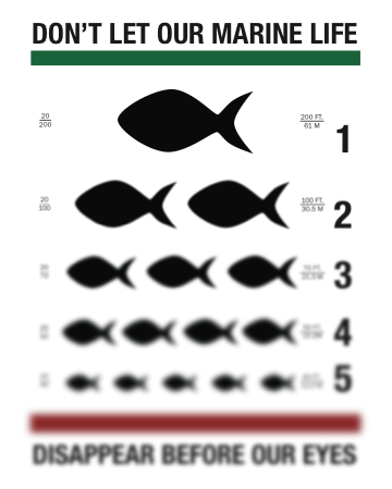
Poster Design: Marine Life Conservation
Project 3 (Design 3): Design a poster for an issue in a chosen field. My poster was inspired by hospitality management and controversial menu items but could also be read as an animal conservation poster. My visual inspiration was based on an eye chart.